If you are a startup’s founder, or if you want to be, one of the frequent things to do is to be ready for pitch presentations. In this post, our main focus is designing an impressive pitch deck. There is a recipe I formed in the last 5 years of experience:
- Simplicity wins
- Size matters
- Colors attract
- Symmetry speaks
- Font shines
- Time runs

Now you have some outlines for how to design an effective pitch deck. Let’s start from a bit behind. Why are pitch decks essential? Even if you have an excellent designer on the team, remember you are the one who will pitch in front of an audience. Even if your co-founder is the main presenter, there can be some circumstances you should present your loved baby startup to various people. Then knowledge is needed.
These types of pitch decks are mostly required for startup competitions, applying for business incubators or accelerators, and an inevitable part of meeting with investors. In most cases, pitch time is limited to 2-3 minutes. So you need to be clear and organized.

In this post, we are only discussing the designing part of the presentation. A startup pitch is a conversation, and by pitching, your aim is to tell a story and help the audience build an emotional tie with your solution. So, in the following blogs, we can define the needed content for a successful startup pitch.
After being awarded at the sTARTUp day Estonia event, I got positive feedback from the audience regarding my presentation, in this event, we also won a financial grant from Tartu city Government. That was one of the best performances I experienced. I have been in this ecosystem since the age of 18, and now by looking back, I see how amateur pitch decks I designed. But we learn on the way. Now, even if you do not have a startup probably, you will need to prepare a presentation during your study or work life so that you can utilize these techniques that I used too.
Simplicity always wins?
We are confused when we see very much information at once. Yes! Data, data, and more data are better than fancy words. But likely audience will need clarification. So putting too long sentences and using complicated graphs will make it difficult to focus on your presentation. It is better to touch on one topic in each slide. No more because, again, it is difficult to process information in a short period. Also, it is good to utilize some simple vector graphics and fewer pictures(if you show your product, that is all right to use more). However, overusing them is not a good idea. Remember, less is more.

Size matters?
It may sound like a click-bait news heading, but it really matters in pitch design. Try to use 3 primary font sizes: The biggest for titles, the medium for sentences, and the smallest for references. Thus it will be easy to follow. Also, photos and graphics should fit proportionally to the presentation, not huge or tiny.
Colors attract?
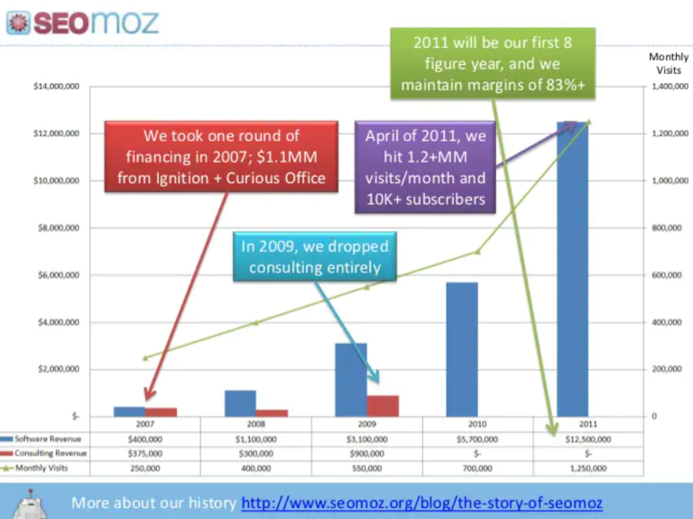
That is fine to use colors in your design(yeah, you can also use only black and white). However, when many colors are mixed, and again, their contrast is too obvious, that is eye-tiring. It is better to prefer your brand color palette. You can also give a message by chosen colors. Also, be sure your text, graphs, and symbols are legible, unlike in this picture.

Symmetry shines?
We, humans, love symmetry. Look nature. Have you ever enjoyed observing snowflakes, honeycombs, traces of leaves, and wings of butterflies, so this list goes forever. We can use this fact in our presentations too. I mostly use Canva for designing my presentations. It gives some symmetry hints and measures that make my work much easier. Also, it looks great. Be sure you open this functionality in which presentation tool you use.
Font speaks✨
Picking pleasant font represents your brand identity too. You can use bold, italic, or underlined letters to emphasize remarkable points and statistics. It is not the right move to select a weirdly-looking font. Also, using more than one font style in a presentation may distract your audience.
Time runs⌛
Startups are like our babies. We sometimes love to talk about them a lot. While designing your pitch, be careful. The time is limited.⚠️ Count the number of words, graphs, and tables added. There should be harmony in your speech and pitch deck.
These were some basics of pitch deck designing. If you follow these steps, I hope you can get some benefits. Also, considering I am not a professional designer, if you have any thoughts, you are very welcome to share.

References:
https://www.ycombinator.com/library/4T-how-to-design-a-better-pitch-deck
2 replies on “How to design an impressive startup pitch deck?”
Great! Thank you very much!
Hey, I am happy you enjoyed it! It’s my pleasure?